Cascading StyleSheet 3 概要
大漠著 机械工业出版社出版 @ 2014年12月第1版
大致把书过了一遍。内容很多是基础 CSS(且废话、废代码蛮多),接触前端两年,早已很熟悉。最后几章介绍transform、transition、animation、响应式布局,内容偏少,且写的不细。总归,这本书让我对 CSS3 有个整体层面上的认识,摆脱之前对 CSS 的局部(错误)认识。但缺点相当明显,质量不高,只适合借阅一读,不适合购买与对 CSS3 的深入理解。
CSS 属性不区分大小写。如:body { MarGin: 0; }。
内联元素不能设置margin-top & margin-bottom,原因是行内非替换元素的外边距不会改变元素的行高。可以设置上下内边距,但仅改变其背景,行高依然不变。
CSS3 选择器
CSS3 选择器在常规选择器的基础上新增了属性选择器、伪类选择器和过滤选择器。
根据所获取页面中元素的不同,将 CSS3 选择器划分为五大类:
- 基本选择器
- 通配:
* - 标签:
<element> - id:
# - class:
. - 群组:
selected1, selectedN
- 通配:
- 层次选择器
- 后代:
E F - 子:
E > F - 相邻:
E + F - 通用:
E ~ F
- 后代:
- 伪类选择器
- 动态伪类(简称LoVe / HAte)
E:linkE:visitedE:hoverE:activeE:focus
- 目标伪类
E:target- 选择匹配 E 的所有元素,且匹配元素被相关 URL 指向
- 语言伪类:根据不同语言版本设置页面的字体风格
- UI元素状态伪类
- 启用
- 禁用
- 选中
- 未选中
- 获得焦点
- 失去焦点
- 锁定
- 待机
- 结构伪类
E:first-child- 等同于E:nth-child(1),index 从 1 开始E:last-child- 等同于E:nth-last-child(1)E:root- 等同于<html>E F:nth-child(n)- n 可以是整数、关键字(even | odd)、公式(2n - 1),n 的起始值为 1E F:nth-last-child(n)- 特殊的,当 n 为 1,则是最后一个元素E:first-of-type- 特定类型的第一个元素E:last-of-typeE:nth-of-type(n)- 特殊的,当 n 为 1,指匹配的特定类型的第一个元素E:nth-last-of-type(n)E:only-childE:only-of-typeE:empty
- 否定伪类
E:not(F)
- 动态伪类(简称LoVe / HAte)
- 伪元素选择器:用于定位文档中包含的文本,但无法在文档树中定位
::first-letter- 选择文本块中的第一个字母,多用于添加排版细节,好首字母下沉::first-line- 匹配 block | inline-block | table-caption | table-cell 等级别元素的第一行::before & ::after- 可以插入额外内容的位置,生成的内容不会成为 DOM 的一部分,但可以设置样式,需配合content属性使用。而:before&:after是用于清除浮动的伪类::selection- 用于匹配突出显示的文本,只有 background & color 两个属性
- 属性选择器
E[attr]- 匹配具有属性 attr 的 E 元素,E 可省略。如a[id] { color: red; },指含有 ID 属性的链接,可a[id][title]这样连续添加过滤属性E[attr=val]- val 区分大小写。如a[id=first],注意没有引号。若是适配以空格隔开的类,则要引号E[attr|=val]- 包含 val 或以 val 开头E[attr~=val]- 包含以空格分开的 valE[attr\*=val]- 只要包含 val 即匹配。如a[title\*='trvalue']E[attr^=val]- 以 val 开头E[attr$=val]- 以 $ 结尾。如a[href$=pdf]
优先级:!important > id > class > tag
可继承的样式:font-size/font-family/color
不可继承的样式:border/padding/margin/width/height
CSS3 边框
1 | border: border-width border-style border-color; |
另两个值可以没有,但一定要有border-style。
border-style
nonehidden- 与none相同,主要用于表的边框冲突dotted- 点状dashed- 虚线solid- 实线,这个值应该用得最多double- 双线groove- 3D 凹槽ridge- 3D 垄状inset- 3D insetoutset- 3D outsetinherit- 从父元素继承
border-color(并没有看懂这节,书上写得相当乱,在此仅mark)
1 | border-top-colors: #111 #222 #333 #444 #555; |
此时:border: 5px solid transparent;
CSS3 背景
背景有五个属性:
background-color: transparent | colorbackground-image: none | urlbackground-repeat: repeat | repeat-x | repeat-y | no-repeatbackground-attachment: scroll | fixedbackground-position
可以统写成一个属性:background: color, image, repeat, attachment, position;
CSS3 文本
CSS 字体类型:
font-familyfont-style: normal | italic | obliquefont-weight: 100-900 | normal | bold | bolder | lighterfont-size-adjustfont-stretchfont-variant: normal | small-caps
复合属性:font: style weight family;
CSS 文本类型:
word-spacing: normal | lengthletter-spacing: normal | lengthvertical-align: baseline | sub | super | bottom | text-bottom | top | middle | percent | lengthtext-decoration: none | underline | overline | line-through | blinktext-indent: lengthtext-align: left | center | right | justifyline-height: normal | length | percent | numbertext-transform: none | uppercase | lowercase | capitalizetext-shadow: color x-offset y-offset blur-radiuswhite-space: normal | nowrap | pre | pre-wrap | pre-linedirection: ltr | rtl | inherit
CSS3 溢出文本属性:text-overflow: clip | ellipsis;,需要配合width & white-space & overflow使用。
1 | .text-overflow-clip { |
CSS3 颜色特性
CSS3 盒模型
- IE盒子 - 包含了 padding & border
- 标准 W3C 盒子
DIV居中:设定宽度,然后margin: 0 auto;
布局
布局是指对页面内容进行分区显示,便于划分功能区。在 DIV 未兴起时,一般使用 table 布局方式,现今 HTML5 与 CSS3 的功能逐渐被浏览器实现,便有了多种布局方式供选择。
多列布局
1 | column-count: 3; |
Flex 布局
2009年,W3C 提出Flex布局,它可以简便、完整、响应式地实现各种页面布局,包括垂直水平居中。
Flex是 Flexible Box 的缩写,即弹性布局,是 CSS3 中的新布局模式,由伸缩窗口和伸缩项目组成。
任何一个容器都可以通过设置display属性为flex | inline-flex得到一个伸缩窗口。如:
1 | .box { |
注意:设置Flex布局后,子元素的float/clear/vertical-align属性失效。布局的传统解决方案,是基于盒状模型,依赖display + position + float实现。
基本概念
采用 Flex 布局的元素,称为 Flex 容器,它的所有子元素自动成为容器成员,称为 Flex 项目。
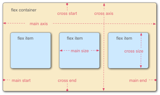
容器有两根轴
- 水平主轴
- 垂直交叉轴
项目默认沿主轴排列。
容器的属性
有六个属性:
flex-direction// row | row-reverse | column | column-reverseflex-wrap// 轴线上排列不下时,如何换行。nowrap | wrap | wrap-reverseflex-flow// 以上两个属性的简写,默认为row nowrapjustify-content// 项目在主轴上的对齐方式。flex-start | flex-end | center | space-between | space-aroundalign-items// 项目在交叉轴上的对齐方式。flex-start | flex-end | center | baseline | stretchalign-content// 多根轴线的对齐方式,若轴线为一则该属性失效,一般指交叉轴上的对齐。flex-start | flex-end | center | space-between | space-around | stretch
项目的属性
也是六个:
order//项目的排列顺序,值越小,越靠前,默认 0flex-grow//项目的放大比例,默认 0flex-shrink//项目的缩小比例,默认 1flex-basis//项目占据的主轴空间(main size),默认值 auto,可以设为widthorheight的值flex//flex-grow, flex-shrink, flex-basis的简写。auto(1 1 auto) or none(0 0 auto)align-self//允许单个项目有与其他项目不一样的对齐方式,可覆盖align-items属性,默认值auto,表继承父元素的align-items属性,如无父元素,则为stretch
CSS3 渐变
渐变是两种或多种颜色间的平滑过渡。在创建渐变的过程中,可以设置多个中间颜色值,称之为色标。每个色标包含一种颜色和一个位置。
CSS3 变形
transform属性指一组转换函数,transform-origin属性指定元素的中心点在哪,新增加了第三个属性transform-origin-z,控制元素三维空间中心点。transform-style的值设置为preserve-3d,建立一个3D渲染环境。
transform 属性
transform: none | <transform-function> [<transform-function>]*
可用于内联或块元素,默认值为none,表示元素不变形。
2D transform 常用 transform-function 功能
translate(10px,20px): translateX() | translateY()scale(2,4): scaleX() | scaleY()rotate(30deg)// 从中心旋转 30 度skew(): skewX() | skewY()matrix(): 基于 X 轴和 Y 轴坐标重新定位元素位置
如:
1 | transform: translate(10px,20px); |
3D transform 常用 transform-function 功能
translate3d(30px, 30px, 200px)- 指水平向右垂直向下各移动 30px,并且离观察者近 200px,即元素变大了translateZ(200px)- 即translate3d(0, 0, 200px),它们都类似于二维空间的scale()函数scale3d(sx, sy, sz)scaleZ()- 即scale3d(1, 1, sz),它们需要要配合其它变形函数一起使用rotate3d()rotateX(45deg) | rotateY() | rotateZ()- 沿相应轴顺时针旋转多少度prespective()matrix3d()
旋转中心点,默认是元素中心,即50% 50%处。单位可以是百分比、em、px等具体值,也可以是 top、left 等关键词。语法:transform-origin: x-offset y-offset z-offset;。常配合transform其它子属性使用。
transform: translate(50px, 50px) translateY(50px);指以元素中心点进行偏移,这里用了两次,效果叠加。PS:一般浏览器可视区域左上角坐标为 0,向右向下方向为正值。
transform-style: flat | preserve-3d;是 3 D空间属性,它设置在父元素中。
3D属性:perspective: none | length;,指视距,单位为 px,也需要设置在父元素上。或写成transform: persective(100px);,值只能大于 0,写在当前变形元素上,且可以与其它transform函数一起使用。
perspective-origin是 3D 变形中另一个属性,决定perspective属性的源点角度,必须作用于设定了perspective属性的元素上。
backface-visibility: visible | hidden;属性决定元素旋转背面是否可见。
CSS3 过渡
语法规则:transition: property duration timing-function delay。如transition: background 2s linear 2s, border-radius 3s ease-in 4s;,用逗号分隔多组操作,最后一个延迟的起始时间一致。该属性写在初始值上。
一般通过hover、focus等触发,也可通过媒体查询触发,如下:
1 | .transition { |
还可以通过 JavaScript 触发:
1 | // css |
开关状态的过度方式:
1 | .example { |
这样,当鼠标悬停于元素上时,过渡2秒。返回初始状态时只要 0.3s,有助于提高 UI 元素的可用性。
CSS3 动画
通过transition实现的动画,功能有限(只有start & end两种状态),于是有animation属性。它可以通过关键帧控制动画的每一步,从而实现更复杂的动画效果。
动画由两部分组成:
- 定义动画:使用
@keyframes规则来声明关键帧(通过 from/to 或者百分比),并需要给动画命名。 - 将其赋给指定的HTML元素
在创建了关键帧声明块后,要把动画赋给HTML元素,并为该元素定义一个属性列表,共有八个子属性:
animation-name: drive;// 指定关键帧动画的名字,这个动画必须对应一个@keyframes规则animation-duration: 2s;// 动画持续的时间,单位为秒animation-time-function: ease-in;// 默认为 ease,另有 linear | ease-out | ease-in-outanimation-delay: 2s;// 延迟多久才播放animation-iteration-count: 1;// 默认为 1 次,定义重复播放多少次动画,另有 infiniteanimation-direction: normal;// reverse | alternate | alternate-reverseanimation-play-state: running;// running | paused,控制动画的播放状态animation-fill-mode: both;// none | forwards | backwards
简写:animation: <name> <duration> <timing-function> <delay> <iteration-count> <direction> <fill-mode> <play-state>。
time-function还可以使用steps,如steps(10)就是将动画分成 10 份,常配合背景图使用。
@keyframes语法规则
1 | // 定义名为 change 的动画,0%即是 from,100%即是 to |
首先声明一段动画,赋与change名称。然后在元素上应用animation属性,它有上述列表中 8 个值,上例只给出了 5 个值,其中倒数第二个值 100 指循环次数;最后一个值指上一次结束后,原路反方向播放动画。
1 | //HTML |
通过animation-play-state来启动或停止动画,如把hover作为触发器,也可以结合JavaScript来使用,形成更复杂的交互。
1 | //HTML |
一个对象多个动画:
1 | //HTML |
缓动函数
缓动函数指定动画效果在执行时的速度,使其看起来更加真实。
媒体特性与 Responsive 设计
媒体类型的引入方法
<link href="style.css" media="screen and (max-width: 600px)" />- @import url(style.css) screen;
- @media screen and (max-width: 960px) { … } // 这种方式最常见
上面第三种方式的格式是:@media 媒体类型[ and (媒体特性)]* {样式}
当响应式设计页面在智能设备中进行测试的时候,所有的媒体查询都不会生效,因为它们使用了一个比实际屏幕尺寸大很多的虚拟可视区域,主要目的是让页面在智能手机上阅读时不会因为实际可视区域而变形。因此在智能手机上需要一个特殊的meta标签。如:<meta name="viewport" content="" />。
其中content的值有
width: number | device-widthheight: number | device-heightinitial-scaleminimun-scalemaximun-scaleuser-scalable
如:<meta name="viewport" content="width=device-width; initial-scale=1.0" />。
嵌入 Web 字体
使用@font-face模块,不管用户电脑是否安装对应字体,只要服务器端有即可显示该字体。
在<style>标签中如下所示引用
1 | @font-face { |
生成工具
CSS3 Maker
在线演示渐变、阴影、旋转、动画等效果,并生成对应效果的代码
CSS3 Generator
CSS3 代码生成器,支持圆角、渐变、旋转和阴影等特性,带预览效果